ul. Maxa Berga 7,
54-115 Wrocław
Poland
Case study
The municipality of Duszniki Zdrój approached us with the task of rebranding. Our mission was to change people’s perception of this Lower Silesian resort from a spa town to a place boasting with culture and sports as well. After coming back from an in-depth research, we decided to launch a tourist-dedicated website free from any dull and bureaucratic jargon. This is how Visit Duszniki was born.

Identify
that maters

Logotyp

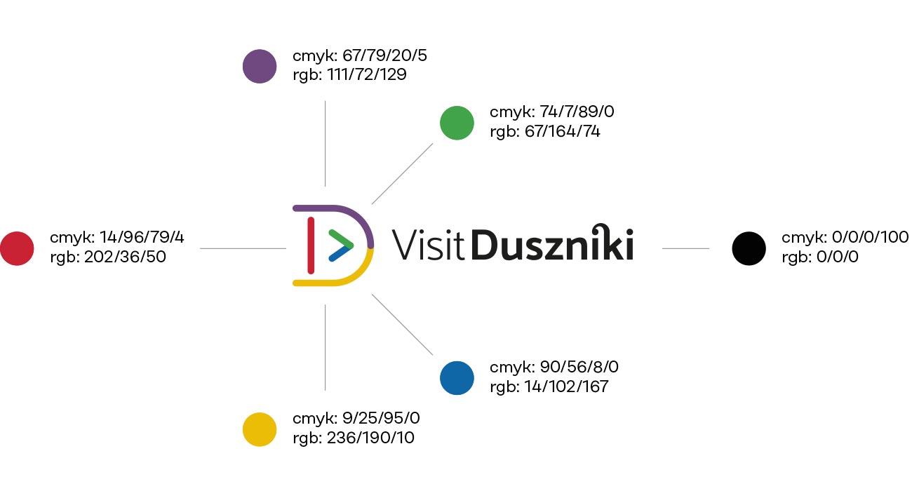
Consequently, while designing the logo, we wanted it to convey a completely different set of emotions. The logo we designed expresses both the restless energy and remarkable modernity that settled in. Its unique form depicts an immense diversity and a sea of opportunities Duszniki Zdrój offer. They’re expressed by a tiny detail – a play button like the one you can find in any video, or music player. Also, a keen eye will notice that the caption contains a ligature borrowed from the earlier branding of Duszniki Zdrój. It’s our little nod to tradition.

Colours

Colors mark the distinction of five types of tourist attractions Duszniki Zdrój offer: urban area, sports, nature, culture and tourism. They connect all together and symbolize the multitude of attractions. A unique color palette set a simple, friendly and energetic vibe that gives Duszniki Zdrój a breath of fresh air.

Icons

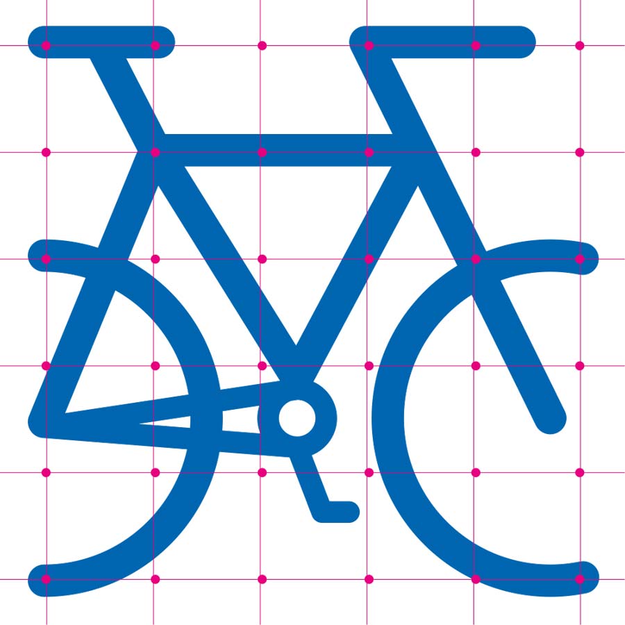
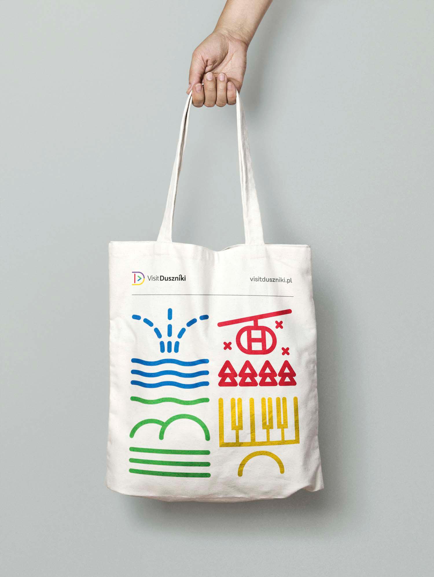
Each type of tourist attractions one can enjoy in Duszniki Zdrój is depicted by a unique icon. What’s more, we created a handy icon grid which makes the placement of icons on any marketing materials easier. Icons are the core of the town’s visual identity and connect its entire key visual